Monday, 31 January 2011

Costume and Prop Ideas


Above are examples of the costume and props that I want my models to wear/use. The reason for this is they act as clear signifiers of the Indie Rock genre. My models usually wear this type of clothing so it shouldn't be a problem sourcing it. If they don't have specific clothing that I like then I have a range of similar garments in my wardrobe.

The props are easy to get hold of as my front cover models are in a band and have access to them.

For my front cover I was going to re-create a pose similar to the one below;

In my shot though there would be four band members and rather than clenching fists the lead singer will be holding a microphone and the basest  will be holding a guitar. I will use similar clothing to that in the image but i will use a white backdrop rather than a black one.

On my contents page I was going to have a few images of bands and solo artists to indicate stories and features in the magazine. I'll use images similar to those below;


I will use people from my class to do these shots and create model release and call sheets for each of them.

My double Page spread is going to be a review of a new album - the same band that is featured on the contents page. The main image will cover one whole page and will be similar to the one below


Again my models have access to similar costumes. I just need to source a suitable location to take a shot like this.


Monday, 24 January 2011

Photography Test Shoot


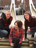
This photograph that i took outside of the college in a way would be a good layout for a front cover, with two people stood above to the sides and the main person in the middle. But the reason why it would not be very effective for a front cover is that the background isn't suitable to put a mast head on as there are cars and buildings that are clearly visible.  It could possibly be used as a DPS photo because it looks as if they are just hanging out and it could be quite a relaxed photo which could suggest that they are fun and outgoing which is a good thing for a DPS. Also it could be used in the contents as a small picture because it is just showing the,m being relaxed.


This photo on the other hand could be used as a front cover shot, because it has a lot of space at the top for a mast head and a skyline. Also it has space at the sides for sell lines. A problem with this could be that the model in the middle is too far down, This could be a problem if there was a main sell line stretching through the middle, if so we would not be able to see the models face. It would not be very good to use as a DPS picture as it has far too much space at the top which would be hard to fill with any kind of information. This also could be used as a small contents picture but again there is a lot of space at the top which could be an issue.  


This has the same problem as the first photo as the background would not be suitable for a front cover as in this one there are people who might not want to be in the photo and haven't given you their consent. This would be a major issue as it wouldn't be acceptable to use this photo anywhere in my magazine. On the other hand the positioning of the models not too bad, they are all in the right place for a front cover with plenty of space at the top for a mast head and plenty of space on the side for a few sell lines.


This one is my most professional one as i took it in the studio. This could be used in all aspects of my magazine. Firstly it could be used as a front cover as there is lots of space for sell lines and a main sell line and a mast head. also the models are looking up at the camera which gives a good effect. The facial expressions are good also as they look happy and approachable which is good for in a magazine because you want the reader to relate to them. Secondly this would also be good for a DPS as they look happy and approachable like i said before, but there is some space at the top which could be an issue, this could also be an issue for a contents page picture. 

Photography Research

Audience Research

I want my magazine to appeal to the rock/indie kind of audience. The magazine 'Kerrang" inspires me as it is essentially has an audience which i want to appeal to. Below shows a Kerrang Reader profile, this is useful as it tells me that they are more male orientated, that is what i am aiming for and also i want to appeal to 15-24 year olds. 


http://www.slideshare.net/belair1981/kerrang-readre-profile

15-24 year old readers
60% male and 40% female 
Median Age: 19


Tribes that my magazine will appeal to, and kerrang has give me the idea for this as they appeal to the same kinds of audiences.


the teenagers in this video are part of the indie audience. They say things like their kind of music is their life, and without it they wouldn't be where they are today, this shows the impact that this music has on these people, this is the effect i want with my magazine, and this is why i have chosen this genre of music.


This video shows images of people who are moshers, the music that is playing is punk rock kind of music, this again is part of the audience i want to appeal to. They are also wearing all black, and have long black hair, this again connects with my clothing and prop ideas, showing that this is the audience i am trying to appeal to.


In this video its is said that the look and the hair is the most important, this suggests they have clothes from designer labels and get their hair styled at the best places, another reason why this is the audience i am appealing to.


All of the tribes that are shown in these videos are the kind of audience that i want my magazine to appeal to, these are all interested in rock/indie kind of music and this is what i am trying to acheive with my magazine. In the videos they talk about how much they love music and how they cant live without it, this i important in my magazine audience because i want to appeal tpo people who are interested in music and are very passionate about it.

Tuesday, 18 January 2011

Textual Research