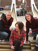
This photograph that i took outside of the college in a way would be a good layout for a front cover, with two people stood above to the sides and the main person in the middle. But the reason why it would not be very effective for a front cover is that the background isn't suitable to put a mast head on as there are cars and buildings that are clearly visible. It could possibly be used as a DPS photo because it looks as if they are just hanging out and it could be quite a relaxed photo which could suggest that they are fun and outgoing which is a good thing for a DPS. Also it could be used in the contents as a small picture because it is just showing the,m being relaxed.
This photo on the other hand could be used as a front cover shot, because it has a lot of space at the top for a mast head and a skyline. Also it has space at the sides for sell lines. A problem with this could be that the model in the middle is too far down, This could be a problem if there was a main sell line stretching through the middle, if so we would not be able to see the models face. It would not be very good to use as a DPS picture as it has far too much space at the top which would be hard to fill with any kind of information. This also could be used as a small contents picture but again there is a lot of space at the top which could be an issue.
This has the same problem as the first photo as the background would not be suitable for a front cover as in this one there are people who might not want to be in the photo and haven't given you their consent. This would be a major issue as it wouldn't be acceptable to use this photo anywhere in my magazine. On the other hand the positioning of the models not too bad, they are all in the right place for a front cover with plenty of space at the top for a mast head and plenty of space on the side for a few sell lines.
This one is my most professional one as i took it in the studio. This could be used in all aspects of my magazine. Firstly it could be used as a front cover as there is lots of space for sell lines and a main sell line and a mast head. also the models are looking up at the camera which gives a good effect. The facial expressions are good also as they look happy and approachable which is good for in a magazine because you want the reader to relate to them. Secondly this would also be good for a DPS as they look happy and approachable like i said before, but there is some space at the top which could be an issue, this could also be an issue for a contents page picture.


No comments:
Post a Comment