Front Cover
This is my mast head, i have layed this out at the top of the page so that it is the first thing everyone will see. Also you can see that i have put a skyline above the mast head which has a picture that relates to it, i have placed this here so that people are drawn towards it and want to read more about it.
These are my sell lines, i have placed them like this on a slant so that they look unusual and new, which relates to the rock genre because the audience like new and unusual music. I have also Placed the main sell line right in the middle so that naturally the readers eye is drawn to it first.
This is my puff, i have layed this out the way i have because it looks kind of like bullet points, this is to show a sense of structure so that it is easy for people to read and so they know exactly what content is in the magazine.
Contents Page
This is the layout of my pictures in my magazine. i have layed them out like this because it makes them look cramped together which suggests that the magazine is crammed with content. I have also placed text on the photos because it stands out and tells the reader exactly where they are going to find the content.
This is my "next week" magazine which is situated at the top left of the page, this is where the reader first looks and i have done this so that they are aware what content will be in next weeks magazine. I have made the picture on a slant so again it looks unusual and grabs attention.
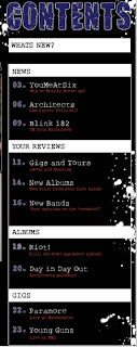
This is my list of contents. I have layed them out like this so that it is an easy list to read. This allows people to chose their own page to look at and lets them go through the magazine with ease. Also i have sectioned it with the white background for the titles and a black background for the content to make it more professional.
This is at the bottom of my contents page, i have located it here so that when people are finished reading through the page they see the website and that makes them want to go on the website.
Double Page Spread
This is the text i have placed at the top right of my DPS. I have placed it here because it is the most important part of the page as it describes the whole story. Also some of the text is on a slant to make it look more attractive.
This is another piece of text placed in the top right. This is above my main article, i have placed this here so that people look at it before the article and so that they know what it is about. Also you can see on the right hand side is another piece of text which is placed on a white paint splash. i have done this for attractiveness which is very effective for getting the readers interested. Also there is a picture underneath which relates to the article, this is why i have placed it here.
This is my article. I have layed it out like this because it is very easy to read as it is in 2 separate columns which have the same size text. I have put it on a black background so it stands out more. I have also put pictures at the bottom of the page which is effective because it makes it look like there is not as much to read rather than it being really long and boring.


No comments:
Post a Comment