Blogger was the internet software that i saved all aspects of my work to, which allowed me to develop and record all of my ideas. It allowed me to post all of my work in the order of when i did them which kept everything in order and easier for me to get work done efficiently. I learned a lot from it as i now know how to use it properly as i am able to edit posts, make my blog public, look at other blogs, how to import pictures and videos ect. Blogger helped me because it allowed me to keep on top of my work, and i knew it was secure and that my work was safe. Also it was more time efficient because i could access it from home. Without this program i wouldn't have been able to save all of my work online, which would have taken more time which would have made me lose out on time i needed to improve my product.

I used the iMac's for everything in my product, it allowed me to access all of the other softwares, it allowed me to upload photos for my product, it allowed me to save files to my own space so that i knew where my work was at all times. I have learnt how to use the macs properly throughout making my products as i now know how to completely function the iMac, i know how to find programs and open programmes which proved to be very useful. The iMacs helped me a great deal because it made my work easier to access and easier to work with. Without the iMacs i would not have been able to complete my work to a high standard because i would not have had all of the programs i needed to ensure my work was at a high standard.

Photoshop was an essential piece of software that i used throughout the development of my media product. It allowed me to manipulate images for my front cover, contents and DPS which was a vital part of my work. It also allowed me to create my actual magazine as i used it to put all of my imagery, text, colour, importing fonts, using layers to manoeuvre content on my product easily. Throughout using photoshop i have developed my skills and learned how to manipulate imagery to a high standard, i have learnt how to use brushes and import new ones, same with text and importing new types, i have also learned how to use layers correctly and how to edit them individually. Another thing i learned is how to manipulate the text and make it any size, shape or colour, i could use the characters box and used tracking, leading and kerning to improve the look of my text. It helped me largely because it made it easier for me to create my product to a high standard. Without Photoshop i would not have had a high level piece of work, i wouldn't have been able to get the product done as quickly and as efficiently as i did.

In Design is another software that i used for importing large amounts of text for my contents page and for my DPS. I learned how to manipulate text and make it fit better in my magazine and also learned how to make a picture box and place a picture inside of it. It was quite helpful because it allowed me to put my article into columns to make it look more professional, same with my contents page it allowed me to do the same thing with the list of contents. I found that if i didn't have this software it would have been harder for me to use the text in my final product.

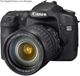
I used the camera's to actually take all of the photos which are in my magazine, i learned how to take pictures using depth of filed as i could take a photo of my model and make the background blurry so that all of the focus was on them. It has helped me because it has given me all of the photos that i have got in my product. Without this i would not have had good quality photo's or i would have had no photos at all which means i would have a product that wasn't at a high standard or it could have been unfinished.
The Lighting was another thing that i used in the development of my product as i learned to use it to manipulate my photo's taken with the camera by making my photo's look darkened to fit in more with the genre i was trying to relate to. This helped me a lot because i needed my photos to be a bit darker so that it did relate to the genre, and without the lighting setup i wouldn't have been able to achieve this so my product wouldn't have been at the high standard that it is at now.
Pixton is a program that i used online to make a kind of comic strip which i used for putting information into my blog but making it look more appealing. This enabled me to present my information in a more creative way and it also allowed me to answer my other evaluation questions more clearly. Without this i think i wouldn't have been able to use any creativity with my information.
Another program that i used online is Prezi, which again allowed me to make the information i had gathered more interesting by making it flow through showing creativity and making it look more appealing to people. Without this i wouldn't have been able to do my initial research as quickly as i did.
Slide share is another program used through the internet, this allowed me to put my powerpoint on the internet and into my blog. This helped me because i wouldn't have been able to put the information into my blog in a powerpoint format without using this.
Final Cut Express is a software that allowed me to make my own video's. I have used this in one of my other evaluation questions which helped me make the video shorter which is easier to understand. Throughout the making of my magazine it has helped me gather information in my Audience research as i recorded myself asking questions about what people looked for in a magazine which contributed to my final product. Without this i wouldn't have been given as much clear feedback from my peers as i did which would result in my product being at a lower standard.
I used GarageBand in one of my other evaluation questions to create a soundtrack to go behind a video that i had made. It was useful because it enabled me to make my own song and be creative, and also it allowed me to convert it to MP3 Format which i combined with a video. Without this my evaluation question would have just been a boring video with no sound and just moving images which wouldn't have been very creative.
Another software that i have used is PhotoBooth, this program allowed me to gather feedback on my final product in another of my evaluation questions. This was helpful because it's very simple to use and it is very effective as it is not time consuming. Without this i would have had to record multiple videos using a tape which would have taken a very long time, but with this program i was able to record one after another.
Another program i used was Screen Grab, this was very useful because it allowed me to show the progress i was making through my magazine as i could screen grab parts of my magazine and show how i have changed it. Also it allowed me to screen grab things off other magazines in my research to compare to mine. Without this it would have been harder for me to compare certain things in my magazine because i would have had to crop my image and save as a jpeg file.
I used the internet for most things in the build up to my final product, i used it for slideshare, prezi, pixton and dafont.com, without all of these i couldn't have made my magazine to my full potential so therefore the internet played a very important role in the making of my magazine.
Microsost Word also played an important role in the making of my magazine, this is because i used it for my call sheets, recce and risk and hazard assessment. This was very useful as it was easy to use and i was able to import photo's into it and large amounts of text. Without this i could not have used any of the photos that i used because i needed the call sheets to use the photos and also i would not have been able to shoot in the location i did without the recce.