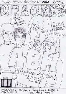
This is a flat plan idea of my front cover for my magazine "cracked". I have chosen to have an image of a band who are looking directly at the camera but with the lead singer closer to it than all the rest. I will have them wearing clothes that relate to my genre of music as you can see in my mood board, black skinny jeans, black hoodies, checky shirts and other things that relate to this. I will use a microphone for my prop, this is for the lead singer to hold and to pretend to sing, this will also be useful to relate to my audience. The masthead on my magazine is going to be a font that looks broken/distorted. The mast head will be called"cracked" which relates to the kind of font i am using and also with the rock genre. My sell lines will all be in a bold typewriter kind of font, this isn't shown on my flat plan but it is shown in my font research post. The colours i am going to use in my front cover will be a white background, with the mast head as a royal blue with a grey stroke around it, then for my sell lines i will use a white font with the same royal blue stroke but i will make the stroke have a larger area. i am also going to have the puff Blue with a grey border, and for the skyline i am just having a plain black font. I have used words like "New" and "win" and "more" all of these words will make the reader want to find out more about what is inside.
This is a flat plan of my contents page in my magazine "cracked". I have layed it out so that as soon as you look at the page, you can see the first picture which is quite large. The other pictures are smaller but still are just as effective as it has the same effect of people want to read more. The Large picture will be of a big leeds festival logo with "2011 lineup revealed" underneath, This will make people want to read on as it is a popular festival. Also using the word "revealed" makes it seem exclusive in a way. The smaller pictures will have a small picture of what is going to be on my DPS, this will be a picture of the artist holding her new CD. And the other smaller picture will be of another one of my models, modelling merchandise. Also in my pictures i will have the page number in a royal blue colour to stand out so readers know where to find the information easily. This has a good effect because people want to know where they can find the article the picture is about and will read on. I have taken my inspiration fro 'kerrangs' magazine, who once had a similar layout. I have also used a Large font for the title of the contents which is "contents" which will be in the bold typewriter font which again can be seen in my font research. On the right hand side i have layed out a kind of list of contents which are broken up by smaller headlines. This is a good way of laying it out because people then can choose what they read. Also the colour for this will be a royal blue for the headlines nut then for the text underneath it will be in a grey colour. The background for this page will again be white.
This is a flat plan of my DPS. For the main image, it will be of the artist in the studio with an amp a guitar and a microphone. It is meant to look like she is recording a song or playing a song. This will make my artist look like she is professional yet she is having fun with her music as her facial expression is smiling. The main image will take over all of the left hand side page but i have a text box diagonally placed over the top left corner as seen on the Flat Plan. This is so people will automatically look at the picture but then also the text will catch their eye so they will read it. The colour of this is going to be in a plain black bold font so it stands out on the white background, but her name will be bigger than the rest of the text to show that her name is important so people will remember it. On the right hand side of my DPS i will have the headline "Return of the Fonz" in a quite posh looking font, this is so she seems more girly rather than having a rough text. This text again will be in plain black with a light colour red stroke because the album she has released will be red and black coloured too. The picture of the CD will be sized similar to what i have done on the flat plan but maybe i will move it up an bit and make the headline smaller. I have also used the space in the top left to have some text saying " Order through cracked.com for 25% off!" this will make the reader want to buy the album and also it will stand out on the page. I will have 2 columns for my article which have small headlines, the one on the left will say "your Questions answered" this is so that the reader feels closer to the artist when they read it. The article headline on the right will say "The road to success". The Column on the left will be slightly larger so i can fit more Questions and Answers into it. the one on the right will be slightly smaller because there wont be as much to talk about.


No comments:
Post a Comment