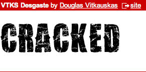
All of these font insipered me toward what kind of font i want to use on my own magazine. These fonts are very usefull as the distorted cracked kind of font appeals to the younger generation as it looks like some other magazines as they use it too. Also it fits in with the actuall rock genre, as it is cracked and sctrathed which is the way rock is portrayed.
I intend to use this type of font for my masthead. Below is an example of what it would look like as my magazine will be called Cracked.
For my sell lines i am going to stay with the kind of cracked/distorted theme, but in a typewriter kind of text. I am doing this to keep the fonts on the magazine similar by keeping this effect yet bringing a new font so it all doesnt look the same and boring.
The font below is the kind of text i would like to use and this is what it would look like.


No comments:
Post a Comment